Grounded Explanations: Combining Real Counterfactuals with Saliency Maps for Honest AI Interpretability
TL;DR: During my internship at Coinbase this summer, I implemented a novel tool to generate local explanations for deep neural networks.
A New Approach to Model Explanations
I'm Will Kalikman, a master's student studying computer science at ETH Zurich. This summer, while interning with the machine learning risk and platform teams at Coinbase, I was tasked with developing methods to generate local explanations for model predictions. When evaluating off-the-shelf solutions, I encountered two critical problems: they generated explanations based on impossible scenarios, making them hard to trust or act on, and they weren't transparent about the comparisons underlying their outputs. This led me to build a novel explainability tool that combines real counterfactuals with saliency maps to provide actionable, grounded explanations.
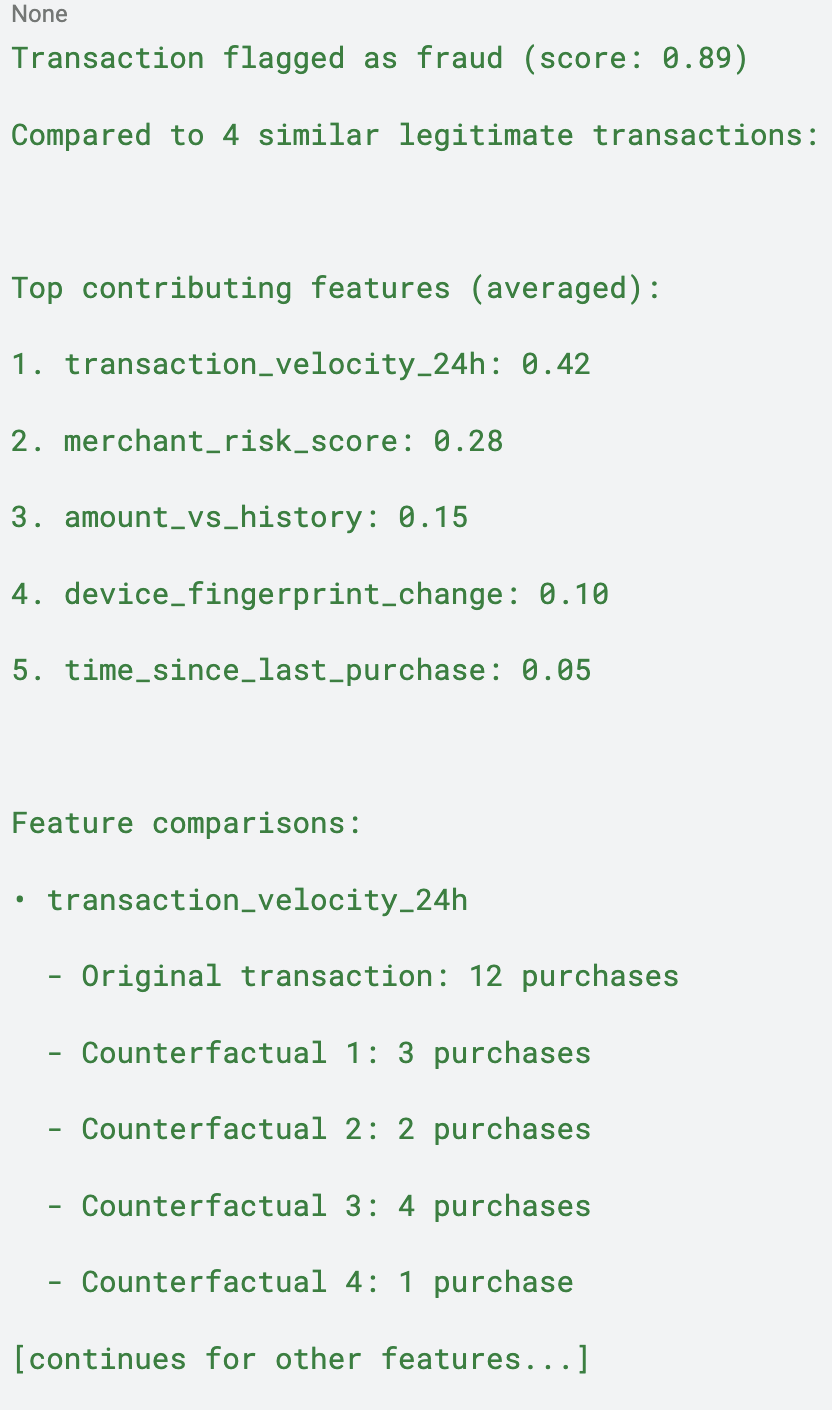
When this tool explains why, for example, a transaction was labelled as “high-risk”, it provides real transactions that were labelled “low-risk” and highlights exactly which features drove the different outcomes. No synthetic data, no hidden baselines, no pretense of "absolute" importance, just honest, comparative explanations.
Example Output: [note: these are NOT real Coinbase features]

The Need for Better Explanations
Current popular explainability methods have critical limitations. For example, SHAP explicitly assumes feature independence, but real-world datasets often contain features that are correlated. When SHAP explains a decision on correlated data, it generates out-of-distribution samples that the model was never trained to handle. The resulting explanations reflect the model's behavior on impossible inputs, not its actual decision logic.
Integrated Gradients (IG) has a different problem: it claims to provide "absolute" feature importance by comparing to a ‘no signal’ baseline, but this is conceptually flawed. There's no meaningful "zero information" baseline for most models, and all local explanations are inherently comparative. IG obscures what it's actually comparing while claiming to reveal absolute truth.
We need methods that respect feature correlations and are transparent about their comparisons, which is exactly what this novel explainability tool provides.
How the Novel Method Works
The novel tool takes a fundamentally different approach by combining two powerful existing tools:
Real Counterfactuals via DiCE with KD Trees
Instead of generating synthetic perturbations, there are real counterfactuals: examples from a given dataset that had different outcomes. In a multiclass classification setting, a counterfactual would be a sample classified as something other than the target. In a continuous output setting, there is a defined threshold for what counts as 'sufficiently different.' For example, if outputs range from 0 to 1 and the original sample had a score of 0.9, samples with scores of 0.3 or less may be included as counterfactuals.
Utilizing DiCE (Diverse Counterfactual Explanations) with KD trees allows an efficient search of a given dataset for the most similar examples with different outcomes. These counterfactuals respect feature correlations because they're real data points from the actual distribution the model was trained on, not synthetic combinations that could never occur in practice.
Explicit Saliency Maps Between Real Points
For each counterfactual, a relative feature importance between the instance to be explained and the counterfactual is computed using IG. This gives local feature importance that explains how the feature values varying between the two points affects the difference in their outcomes, not undefined behavior on synthetic inputs.
By combining these two approaches, a system that not only shows what would need to change for a different outcome (counterfactuals) but also quantifies which features matter most in driving that difference (saliency maps) is created.
The Complete Pipeline
Input:
Model to explain
Dataset of real inferences
Target instance (e.g., flagged transaction)
Outcome threshold (what makes another sample count as "different")
Number of counterfactuals desired
Process:
Use DiCE with KD trees to find the k-nearest neighbors in your dataset with different outcomes
For each counterfactual, compute feature attributions between it and the target using IG
Aggregate and rank features by their contribution to the outcome difference
Present both the counterfactuals and the features driving the differences
Output: Real examples showing why your instance got its prediction, with explicit comparisons and actionable feature importance scores.
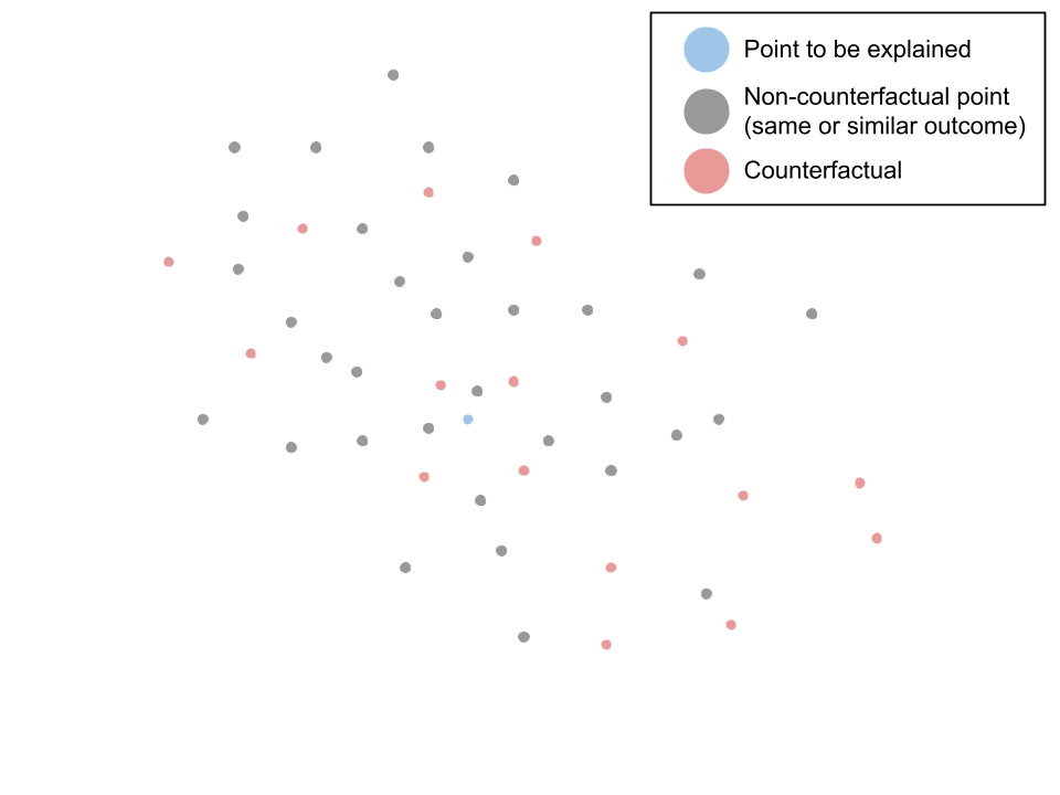
Pictured: point to be explained (blue) among other points in the input dataframe, including some which are counterfactuals (red).

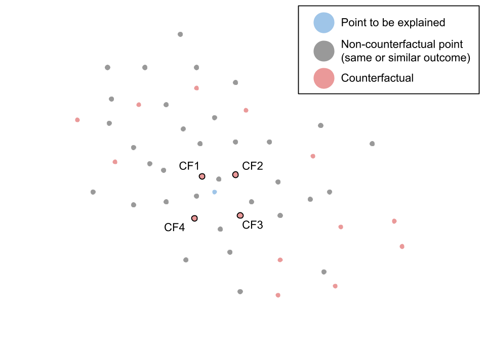
DiCE returns the k nearest counterfactuals, in this case 4.

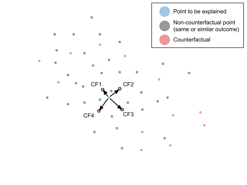
We then use Integrated Gradients to compare the point to be explained with each of the counterfactuals.

What Integrated Gradients tells us is: as we move from target to counterfactual, how much does each feature's change contribute to the total change in model output? Its output is a saliency map for each comparison.

We then aggregate and average the importances returned by each of the comparisons, returning the features importances, and for the most important features, the feature values in the point to be explained and each of the counterfactuals.
Why This Matters
This approach provides three key advantages:
1. Theoretical Soundness: By using only real data points, we respect feature correlations and explain actual model behavior, not responses to impossible inputs.
2. Transparency: We're explicit about what we're comparing. No hidden baselines or bundled comparisons: you see exactly which real examples we're comparing against.
3. Actionability: Showing real counterfactuals with feature attributions gives concrete guidance.
For the Theoretically Inclined: Why Existing Methods Fall Short
The Out-of-Distribution Problem
When SHAP computes feature importance using coalitions, it faces a fundamental question: what values should features outside the coalition take? Its answer, sampling from marginal distributions, breaks feature correlations catastrophically for datasets with correlated features.
Consider a model trained on real estate data where square footage and number of bedrooms are correlated. To evaluate the importance of square footage, SHAP might create synthetic examples like:
500 sq ft house with 5 bedrooms (impossible)
5000 sq ft studio apartment (highly unlikely)
The resulting "importance" reflects the model's undefined understanding at these impossible inputs, not its actual decision logic. The SHAP authors acknowledge this limitation explicitly, stating they assume feature independence. But in practice, this assumption often does not hold, making SHAP explanations misleading for models working with correlated data.
The Baseline Illusion
The Integrated Gradients paper presents baselines as a path to "absolute" feature importance, but this is conceptually dishonest. Every local explanation is comparative. You're always asking "important relative to what?" In IG, the framework the authors provide asks for a point to be explained, and a reference point to compare the point to be explained with. As the authors of the paper write, “For most deep networks, it is possible to choose a baseline such that the prediction at the baseline is near zero (F(x') ≈ 0). (For instance, the black image baseline indeed satisfies this property.) In such cases, there is an interpretation to the resulting attributions: the gradients of the baseline add amounts to distributing the output value to the individual input features."
This may sound reasonable in theory, but breaks down in practice. First, determining what the correct baseline is for a given model is not trivial, and often not possible. One can imagine many image classifiers for which an all black image would not, in fact, be a no-signal input. Similarly, what would the "zero information" state for a fraud detection model? An average input, for example, carries a strong non-risky signal.
And more fundamentally, using this no-signal baseline aims to obfuscate the comparative nature of IG. Why do this? Why pretend that one can generate absolute feature importances for a local explanation? By hiding the comparative nature behind the notion of a baseline, IG obscures what it's actually doing while claiming to reveal fundamental truths.
The novel explainability method embraces the comparative nature of explanations, making it explicit by showing you exactly which real examples we're comparing against.
Conclusion
Explainability shouldn't require us to pretend models behave sensibly on impossible inputs or that absolute importance exists. By combining real counterfactuals with saliency maps, we have a tool that provides grounded, honest, and actionable explanations.
Before trusting any explanation method, ask:
Is it explaining real or impossible inputs?
What's the actual comparison being made?
With the approach I have outlined above, the answers are clear: real inputs, explicit comparisons. That's the foundation for explanations that can be trusted and acted upon.
References:
SHAP paper
This article contains the author’s personal opinions and does not constitute a company policy or statement. These opinions are not endorsed by or affiliated with Coinbase, Inc. or its subsidiaries.


